In Part 1 I was ranting about input validation, now it’s about form sizes.
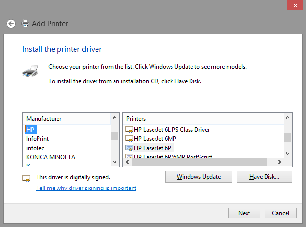
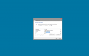
In my previous post I already said that I am not a big fan of fixed size dialogs. They are fine as long as they are large enough to show all of their content, but as soon as there is a list that can grow to an arbitrary size, fixed size dialogs are a no go. Look at the Microsoft Printer installation dialog again:
It contains two lists, one of printer manufacturers and the other of printer models of the selected manufacturer. Of course, it could be even worse and have one list only (And even that wouldn’t have surprised me really. Microsoft has all sorts of bad UIs.). So the list of manufacturers is sorted and even has incremental search. It’s also not too long so it’s probably fine for most users. But the list of printer models is really stupid:
- All printer names are prefixed with the manufacturer name, so incremental search does not help.
- The list is not high enough to display all entries. Thus there is a vertical scroll bar. OK, for several hundred printers listed for HP alone no screen would have been large enough, so it can’t be avoided. But one page only shows 4 lines and the last one is even only half visible.
- And also, the list is not even wide enough to display the full text of the entries. So we get a horizontal scroll bar too which further reduces the number of lines visible.
In my opinion this is really bad UI design. That dialog could be improved a lot by simply changing it to be sizable, anchor both lists to the left, top and bottom and the right list to the right as well.
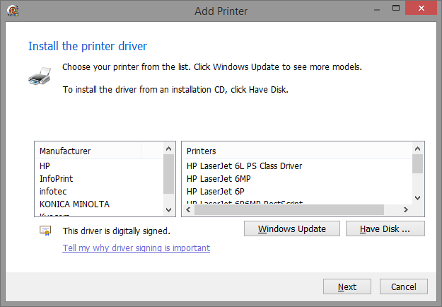
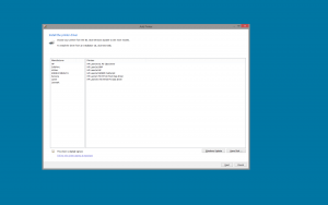
I faked that dialog with Delphi so I could show you what I mean:
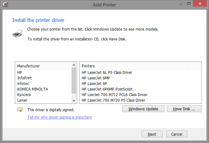
I even reproduced the ridiculously large white areas around the lists. But this dialog can be sized and has even got a maximize button. Let’s see what it looks like if I make it just a little bit larger:
No horizontal scroll bar any more. And all visible lines are completely visible rather than only half of the last one. And if I increased the height even more, it would become much easier to scroll the printer list down to the right model.
OK, so we make all our dialogs sizeable and set the control’s anchors correctly. Easy as cake. Is that it?
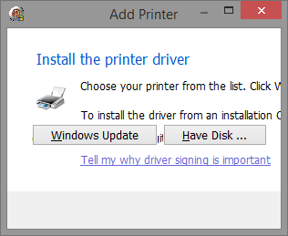
No. With more freedom for the user we get more things he can screw up. Have a look at the next screen shot:
A sizeable dialog can also be made smaller and this is what it looks like. Eeek! So what can we do about it? We set size restrictions.
The easiest way to do that, is designing forms in the smallest size you want them to have and then set its minimum size to the designed size.
I have got two simple helper functions that do this for me:
type
  TControlConstraints = (ccMinWidth, ccMinHeight, ccMaxWidth, ccMaxHeight);
  TControlConstraintsSet = set of TControlConstraints;
const
  ccMin = [ccMinWidth, ccMinHeight];
  ccMax = [ccMaxWidth, ccMaxHeight];
  ccAll = [ccMinWidth, ccMinHeight, ccMaxWidth, ccMaxHeight];
  ccFixedHeightMinWidth = [ccMinWidth, ccMinHeight, ccMaxHeight];
  ccFixedWidthMinHeight = [ccMinWidth, ccMinHeight, ccMaxWidth];

procedure TControl_SetConstraints(_Control: TControl; _Which: TControlConstraintsSet);
begin
  if ccMinWidth in _Which then
    _Control.Constraints.MinWidth := _Control.Width;
  if ccMinHeight in _Which then
    _Control.Constraints.MinHeight := _Control.Height;
  if ccMaxWidth in _Which then
    _Control.Constraints.MaxWidth := _Control.Width;
  if ccMaxHeight in _Which then
    _Control.Constraints.MaxHeight := _Control.Height;
end;

procedure TControl_SetMinConstraints(_Control: TControl);
begin
  TControl_SetConstraints(_Control, ccMin);
end;
So, in the constructor I simply call:
constructor TMyForm.Create(_Owner: TComponent);
begin
  inherited;
  TControl_setMinConstraints(Self);
end;
Since we started out with a fixed size form, this does not have any negative effects. The form still has a minimum size that corresponds to the fixed size it used to have, so even users whose monitors are too small aren’t any worse off, and those who have large monitors can use all the space they want to.
Two more screenshots to just give you an idea of the difference:
This is the original dialog on a 24″ monitor with 1920×1280 pixel resolution:
It feels like a postage stamp.
And this is my fake dialog resized to about 1/4 of the monitor resolution:
(Of course here you see that I didn’t bother to add more lines to the lists than necessary to get my point across.)
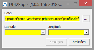
Here is another example where a fixed sized dialog is not a good idea.
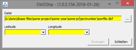
There is one entry field that takes a file name. In a fixed sized dialog you would usually end up with clipping that name because nowadays file names are very long since nobody has to type them any more. If you are a user, you still want to be able to see the full path. So, you simply make the dialog wider and tadaaa:
This is a special case where you probably don’t want the dialog to become any higher than the designed size. So what do you do? Simple, you also restrict the height:
constructor TMyForm.Create(_Owner: TComponent);
begin
  inherited;
  TControl_SetConstraints(Self, ccFixedHeightMinWidth);
end;
Now that user can resize it to make it wider, but the height will not change.
I’ll leave it at that for now. Expect more rambling in a future post.
And while you are waiting for that one, you can read what
David Millington said in his blog posts on How to Design a Great UI (part 2, part 3).
